Unlock your business’s potential with MRB Media’s expert SEO-driven marketing and web design strategies. Book a consultation to start your journey to online success today!
Follow Us Anywhere!
©2024 MRB Media, Inc. | All rights reserved.


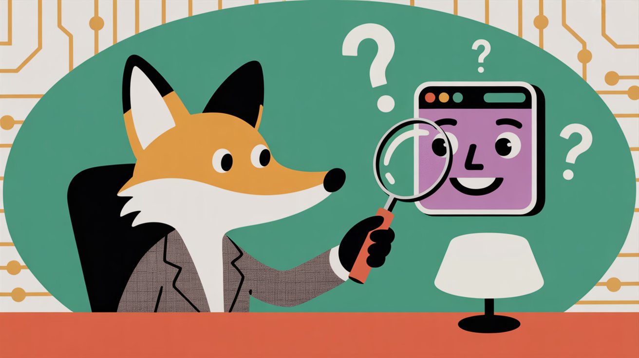
When someone lands on your website, you have only a few seconds to make your message clear. Studies from the Nielsen Norman Group show that users form their first impression of a website in less than one second, but spend roughly 10–20 seconds deciding whether to stay. Those seconds determine whether a visitor becomes a lead or bounces.
The most common reason visitors leave quickly is uncertainty. If people cannot immediately answer the question, “What does this business do?”, they won’t stick around long enough to learn more. In a world of constant digital noise, clarity has become a competitive advantage.
The “What Does This Business Do?” Test is designed to reveal whether your website communicates clearly at first glance. It does not require expensive tools or professional testers. Instead, it focuses on the purest form of user experience research: asking real people what they see and listening to their answers.
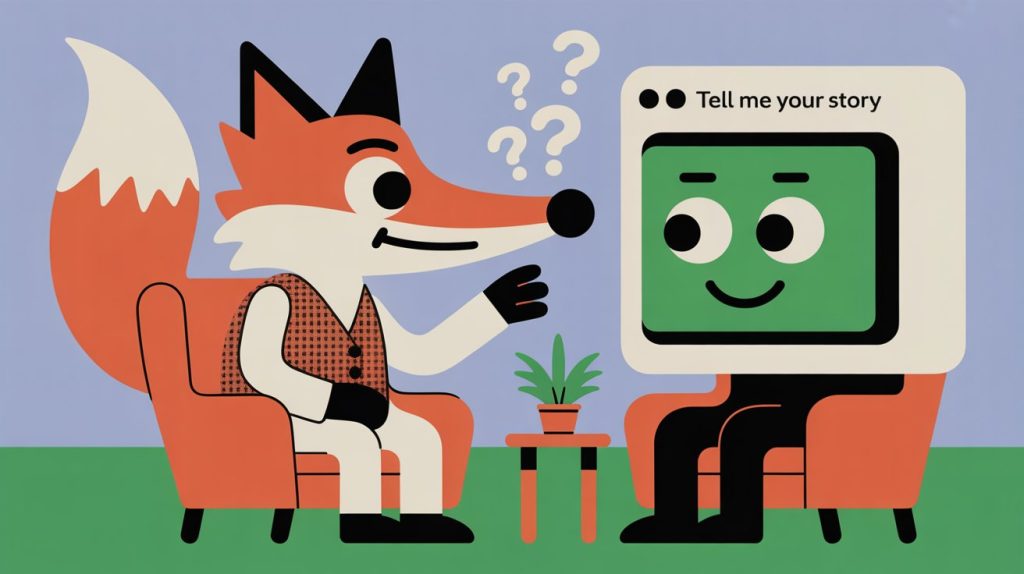
An unclear homepage harms your business in three key ways. First, it reduces conversions. If users must guess what your business offers, they will not click, scroll, or contact you. Second, it damages trust. Clarity signals professionalism; confusion signals disorganization or unreliability. Third, unclear messaging creates wasted advertising spend. When you pay for traffic but users bounce instantly, every dollar becomes less efficient.
Even experienced business owners struggle to evaluate their own websites. You know your services inside and out, so your brain fills in the gaps automatically. Real visitors do not have that background knowledge—they rely solely on what they read and see in the first few seconds.
This is why outside feedback is powerful. User testing cuts through assumptions and reveals blind spots you cannot see from the inside.
The “What Does This Business Do?” Test is simple. You show your website’s homepage to someone for ten seconds or less, then ask them one question:
“Based on what you saw, what do you think this business does?”
The magic of this test lies in its simplicity. You remove distractions, explanations, and scrolling. You give the viewer no time to overanalyze. Their immediate interpretation reflects what a real visitor experiences.
If the answer is accurate, your homepage is clear.
If the answer is vague, incomplete, or incorrect, you have work to do.
This test uncovers several key insights:
It shows whether your headline communicates value.
It measures how well your visuals support your message.
It reveals whether your brand positioning is clear to strangers.
It highlights messaging gaps you may not have noticed.
In many cases, small changes—such as rewriting a headline, adding a subheading, or reorganizing the hero section—dramatically improve clarity.
Source: Nielsen Norman Group, Homepage Attention Study 2024
The beauty of this test is that it requires no budget, no specialized tools, and no technical expertise. You can conduct it with friends, colleagues, customers, or strangers online.
Aim for a diverse group. Ideally, select people who are not familiar with your business. These participants provide the most objective feedback because they view the site with fresh eyes.
Use a screenshot or open the website on a laptop or phone. Do not allow scrolling. The goal is to replicate the initial glance of a new visitor. Ten seconds is enough to absorb the core message but not enough to study the page.
After they view the page, ask:
“What do you think this business does?”
Do not rephrase. Do not add context. Keep it simple.
Avoid helping, clarifying, or correcting during their response. Your goal is not to defend the website but to understand how people interpret it.
Write down answers verbatim. Even small wording differences offer insights. Are people using roughly the same language? Are they confused about your industry? Do they notice different services than the ones you prioritize?
If two or more testers misunderstand your business, the homepage needs adjustment. If most testers describe your business accurately, your message is already strong.
This test provides three categories of clarity signals.
Does the viewer correctly identify what you do? If someone thinks your marketing agency is actually a web design firm, your messaging needs refinement.
Do testers identify your niche or value proposition, or only a broad category? For example, “They sell coffee” is less helpful than “They roast small-batch beans and deliver subscriptions.”
Do testers sound sure about their answer, or do they hesitate? Hesitation indicates uncertainty, even if the answer is partially correct.
Examples of unclear outcomes include:
“I’m not totally sure, but I think you sell software?”
“It looks like some kind of consulting, maybe?”
“It might be a service business, but I didn’t understand what problem you solve.”
These answers show that the homepage needs stronger messaging, visuals, or structure.
Strong user responses sound like this:
“You help small businesses grow through digital marketing services.”
“You’re a real estate agency specializing in rural and suburban homes.”
“You sell premium skincare products for people with sensitive skin.”
These responses indicate that the homepage communicates clearly and effectively.
“If users cannot determine what your business does within a few seconds, your chances of conversion drop dramatically—even if the product is exceptional.”
If the results show confusion, the next step is improving your homepage messaging.
Your headline should answer three questions immediately:
What do you offer?
Who is it for?
Why does it matter?
For example:
“We help local businesses grow through SEO and content marketing.”
“Custom-built furniture for modern homes, delivered nationwide.”
If your headline is short, use the subheading to add specificity or value.
The hero image should reinforce the message. Avoid ambiguous stock photos that do not communicate what you do.
Users should instantly understand the next step. For example:
“Book a Free Consultation”
“Get a Custom Quote”
Long, cluttered menus confuse users. Keep navigation organized and intuitive.
Avoid insider terminology. Use words your customers say.
Many business websites fail this test because of avoidable issues.
Headlines like “Empowering Your Future” or “Solutions for Success” communicate nothing specific.
High-concept images may look attractive but can confuse visitors about what you actually do.
If your homepage reads like a novel, users will skim or skip it entirely.
If users cannot find a visible next step, they are unlikely to continue.
You might assume this test only benefits small businesses, but it is equally powerful for corporate sites. Even large brands struggle with clarity. A test using real users—no matter how simple—provides insights that analytics cannot reveal. Bounce rates show what users do, but user tests show why.
This test also helps you refine tone, structure, and branding. If users misinterpret your value proposition, you know exactly where to adjust your messaging.
Clarity is the foundation of a successful website. When visitors instantly understand what you do and who you serve, every part of your digital presence becomes more effective—from SEO to paid ads to lead generation.
The “What Does This Business Do?” Test is the easiest way to test my website for clarity. It reveals blind spots, strengthens your homepage, and creates a better experience for every visitor. With a few changes based on real user feedback, your website can quickly shift from confusing to compelling.
👉Book a Free Consultation to test your homepage like real users do, uncover messaging gaps, and get a clear plan to make sure visitors instantly understand what your business does.