Unlock your business’s potential with MRB Media’s expert SEO-driven marketing and web design strategies. Book a consultation to start your journey to online success today!
Follow Us Anywhere!
©2024 MRB Media, Inc. | All rights reserved.


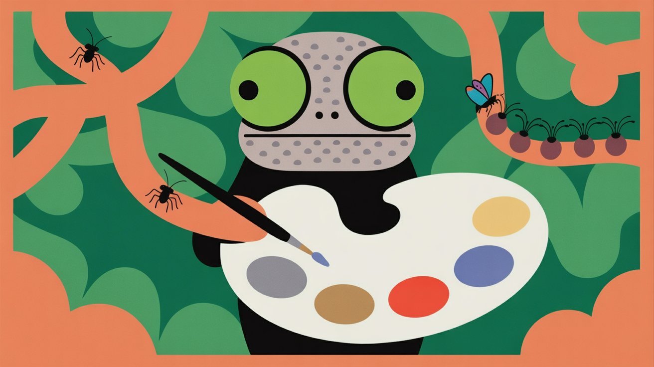
Color is one of the first things users notice when they land on a webpage. Before they read a headline or scan the layout, their brains register the color palette. The psychology of colors website research shows that color influences mood, communicates meaning, and drives behavior—all within milliseconds.In conversion optimization, color is more than aesthetics. It’s a strategic tool that shapes perception and influences decisions. The right button color can increase click-through rates, reduce hesitation, and make CTAs more compelling. Even small changes create measurable differences in how visitors interact with your site.
Color impacts emotion and cognition. Researchers at the University of Winnipeg found that people form subconscious judgments about a product or website within 90 seconds, and 62–90% of that evaluation is influenced by color.Different colors evoke different responses:Blue signals trust.Red communicates urgency.Green feels natural and positive.Yellow grabs attention.When applied intentionally, color becomes a powerful communication tool.
Contrast is a crucial factor in determining whether users see and respond to your call-to-action button. A well-designed button stands out from the surrounding content. Low-contrast buttons blend into the page, while high-contrast buttons attract the eye and encourage action.This is why many modern websites use bold, contrasting CTAs that differ sharply from their overall color scheme. Effective contrast guides the user’s attention and reduces friction in the decision-making process.
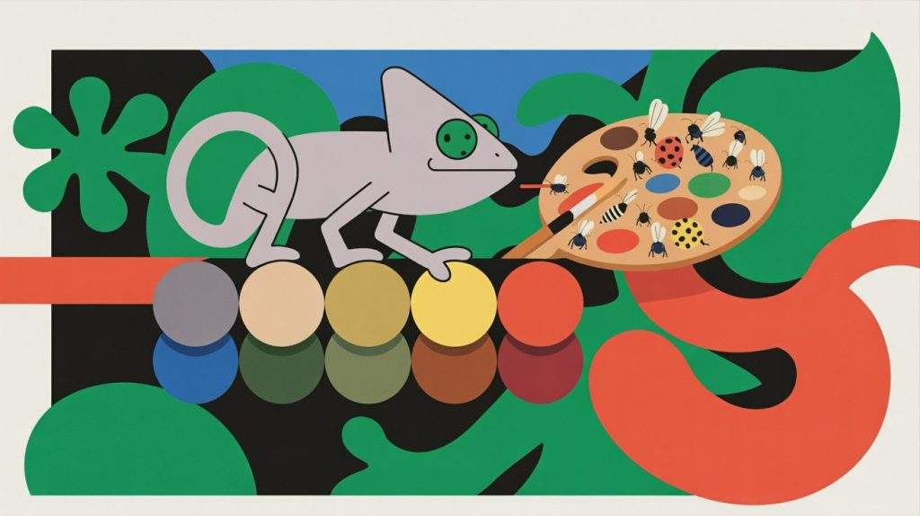
When designing conversions-focused CTAs, the psychology of colors website research reveals that the goal is not simply choosing a color you like but selecting a color aligned with your brand’s message and your audience’s expectations.
Red is one of the most effective CTA colors when urgency is needed. It increases heart rate and triggers immediate attention. This is why limited-time offers or clearance sales often use red buttons.However, red can feel aggressive if used excessively. It works best when used strategically for primary actions.
Blue is often used by banks, tech companies, and healthcare websites because it conveys stability and trust. A blue CTA feels safe and dependable, making it particularly effective for sign-up forms, free trials, or membership conversions.Studies show that blue increases user confidence, especially when the action involves sharing personal information.
Green is associated with positive action and is ideal for “Start,” “Get Started,” or “Continue” buttons. It also resonates with environmentally conscious brands. Green buttons feel natural and intuitive, making them effective for general-purpose actions.
Yellow grabs attention immediately but must be used carefully. It can create glare if overused. Yellow buttons often work for drawing the eye to secondary actions or for brands with playful, bold personalities.
Orange is a top-performing conversion color in many industries. It combines the urgency of red with the optimism of yellow. Amazon famously uses orange for “Add to Cart” and “Buy Now” because it balances warmth with action.
| Color | Visual Example | Common Associations | Best Used For |
|---|---|---|---|
| Red | Urgency, excitement, strong attention | Limited-time offers, flash sales, “Buy Now” buttons | |
| Blue | Trust, security, stability | Account creation, sign-ups, login CTAs, SaaS trials | |
| Green | Growth, success, “go” signal | “Get Started”, “Continue”, checkout progress buttons | |
| Orange | Energy, friendliness, motivation | “Add to Cart”, “Book Now”, primary e-commerce CTAs | |
| Yellow | Attention, optimism, curiosity | Secondary CTAs, feature highlights, promo banners | |
| Black | Luxury, sophistication, authority | Premium products, high-end services, minimalist designs |
Color associations summarized from established color psychology research in web and conversion design.
While color psychology matters, contrast is often the deciding factor in whether users notice a CTA. A button that blends into the background will underperform even if the color is psychologically strong.
Blue buttons on white backgrounds consistently perform well.
Orange buttons on dark backgrounds create strong visual pull.
Green buttons stand out effectively on neutral gray or white layouts.
Red buttons outperform others on minimalist pages with light palettes.
Gray buttons on gray backgrounds create friction and ambiguity.
Dark blue on black backgrounds reduce readability.
Pale yellow on white is often illegible and invisible.
The principle is simple: the button should be the most visually distinct element on the screen.
Color choices should ultimately be informed by data. A/B testing allows you to measure real user behavior instead of relying on assumptions.
Only test the button color. Keep text, size, placement, and wording identical. This ensures clean data.
Popular tools include:
Google Optimize (formerly free, now replaced by alternatives)
VWO
Optimizely
Convert
Elementor Experiments or WordPress A/B plugins
These tools split your traffic into two groups and track which variation performs better.
A/B tests need statistical significance. Let the test run for at least one to two weeks or until you reach a meaningful sample size.
Some colors may get more clicks but fewer conversions. Prioritize tests with revenue impact, not just interactions.
User behavior changes over time. Retest major elements annually or when redesigning your site.
“Color influences up to 90% of a user’s first impression. In conversion design, the button color can be the difference between hesitation and action.”
Color is not just a design choice—it is a communication strategy. The psychology of colors website studies consistently show that button colors influence mood, trust, attention, and action. When you pair a strategically chosen color with strong contrast and clear wording, you create CTAs that guide users effortlessly toward the actions you want them to take.
Through A/B testing, real user behavior reveals whether your assumptions are correct. Over time, these insights lead to higher conversions, more sales, and more intuitive user experiences.
👉Book a Free Consultation to discover whether your website colors are helping or hurting your clicks, and get a clear plan to optimize your calls-to-action using proven behavioral psychology.