Unlock your business’s potential with MRB Media’s expert SEO-driven marketing and web design strategies. Book a consultation to start your journey to online success today!
Follow Us Anywhere!
©2024 MRB Media, Inc. | All rights reserved.


Your homepage is not a brochure. It’s not a digital business card. It’s the moment a stranger decides whether your business is relevant, trustworthy, and worth their time. That decision happens quickly, often before they scroll, before they click, and definitely before they “dig deeper.”
If you care about business growth and clarity, your homepage messaging is one of the highest leverage places to focus. You can improve ads, build more content, and publish more posts, but if the first impression is confusing, you’re pouring effort into a leaky funnel.
The 15-minute homepage clarity test is built around one simple idea: can a real person understand what you do in seconds without guessing? If they can’t, your website is not failing because of traffic. It’s failing because of communication.
This test is fast, free, and uncomfortable in the best way. It removes your internal bias, forces you to see your homepage like a first-time visitor, and shows exactly where clarity is missing.
Most businesses don’t create confusing homepages on purpose. Confusion often comes from trying to sound impressive. Many brands lean into clever headlines, abstract slogans, and vague promises because they want to stand out.
But the truth is simple: cleverness is expensive. It costs attention. It costs comprehension. And it costs conversions.
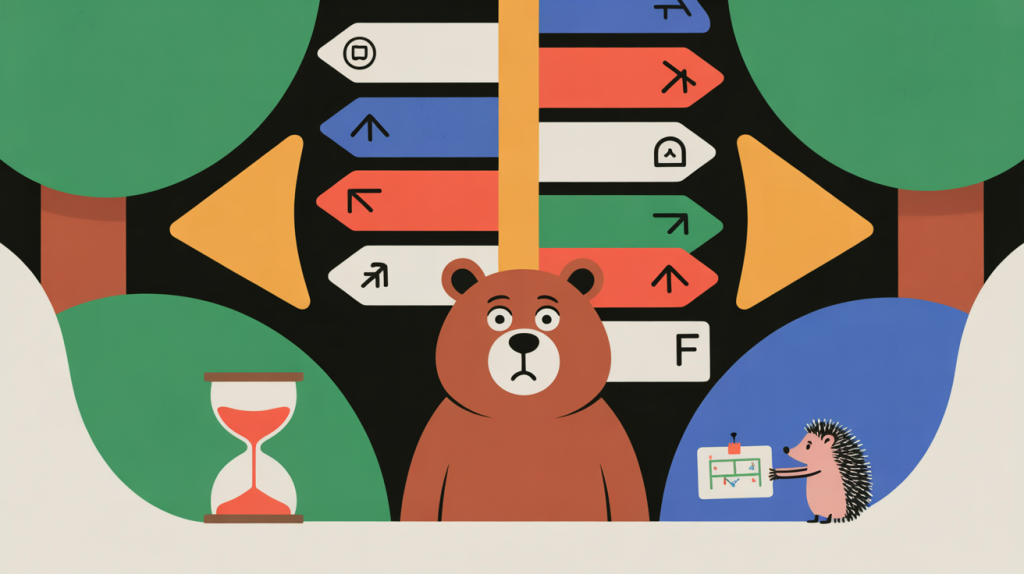
When someone lands on your homepage, they are subconsciously asking three questions:
What is this?
Is this for me?
What do I do next?
If your page makes them work to answer those questions, they leave. Not because they hate your brand, but because their brain doesn’t want extra effort.
Clear messaging lowers cognitive load. It gives visitors a fast “yes” or “no.” That sounds risky, but it’s actually what drives business growth and clarity. You want the right people to keep going and the wrong people to leave quickly. Clarity does both.
People interpret clarity as competence. A business that communicates plainly feels more confident and more honest. A business that communicates vaguely feels uncertain, even if the service is excellent.
Trust is a conversion multiplier. A clear homepage earns trust before someone ever clicks a button.
Visitors scan, they don’t study. They pick up your headline, a few lines of supporting copy, the main visual, and the primary call-to-action. If those pieces don’t work together, the visitor never gets to your “great content.”
Clarity wins because it survives skimming.
Confusion doesn’t always show up as a dramatic bounce. Often it looks like “meh.” People hesitate, scroll without direction, click random navigation items, or abandon the site quietly.
That’s what makes it so dangerous. Confusion creates invisible losses.
When a homepage tries to communicate five services to five audiences with five calls-to-action, visitors don’t know where to start. And when people don’t know what to do, they do nothing.
This isn’t about short attention spans. It’s about decision fatigue. Your job is to make the next step obvious.
Conversions are built on confidence. Visitors take small steps when they feel safe: read a section, click a button, check pricing, request a quote. Confusing messaging breaks that loop. It introduces doubt early, which prevents action later.
Business growth and clarity require a homepage that creates confidence quickly.
Even if your ads are strong and your content is good, those channels ultimately send people to your website. If the homepage is unclear, the visitor’s trust resets to zero.
That means your marketing doesn’t fail because the strategy is wrong. It fails because the landing experience is unclear.
This test isn’t complicated. It’s not a full usability study. It’s a simple way to identify whether your homepage communicates the essentials.
The goal is to measure understanding, not preference. You’re not asking people if they “like” your website. You’re checking whether they understand it.
A screenshot of your homepage or the live page loaded on a laptop or phone, and three to five people who don’t know your business well.
That’s it.
Choose people who match your audience loosely, but who are not already familiar with your business. If they already know what you do, the test is meaningless.
If you can, include at least one person who is your ideal customer type. Their feedback will show whether your message matches the market.
Open the homepage and let them look briefly. No scrolling. No explanation. You’re simulating the first impression experience.
Then close it or turn the screen away.
Ask exactly these questions:
What do you think this business does?
Who do you think it’s for?
What would you do next if you were interested?
These questions reveal clarity, audience targeting, and call-to-action strength.
Write down what they say. Do not interpret it. Do not correct it. Their phrasing matters because it tells you what message your homepage is actually sending.
If answers are consistent and accurate, your homepage is clear. If answers are vague, conflicting, or incorrect, confusion is present.
A common clarity problem is when people can guess the industry but not the offer. Another problem is when they understand the offer but not the audience.
Both reduce conversions.
Clarity is not about having more text. It’s about having the right text in the right order.
A clear homepage usually includes:
A headline that states what you do and the result
A subheadline that adds context or specificity
A primary call-to-action that stands out
Proof elements near the top (reviews, logos, credentials, numbers if valid)
A simple “how it works” section
A section that clarifies who it’s for
Objection-handling copy (pricing, timelines, guarantees, FAQs)
When these elements are present and organized, visitors feel guided instead of overwhelmed.
You do not need a redesign to fix clarity. Most clarity improvements are copy and layout decisions.
Replace vague brand slogans with a sentence that answers “What do you do?”
A strong headline is plain. It doesn’t try to be poetic. It tries to be understood.
If you want business growth and clarity, you need a single primary action. Booking a call, requesting a quote, getting a demo, or starting a trial are examples. Pick one.
Secondary actions can exist, but the primary should dominate.
Trust needs to show early. Testimonials, review stars, recognizable client logos, certifications, years in business, or measurable outcomes help visitors feel safe.
If you can’t claim numbers, don’t. But you can always claim proof: real reviews, real logos, real credentials.
If visitors must guess who the service is for, remove the ambiguity. Add a section that clearly states: “This is for…” and list the audience types in plain language.
If visitors must guess the price range, clarify it. If they must guess the process, explain it.
Clarity reduces friction.
Hero images should support understanding, not distract. If your image looks like generic stock photography, it adds nothing. If it creates confusion, it actively harms.
Show the product, the process, the result, or the person behind the business.
| Clarity Element | What to Check | Score (0–2) |
|---|---|---|
| Headline | Explains what you do in one sentence | 0 1 2 |
| Audience | Clearly states who it’s for | 0 1 2 |
| Primary CTA | One main action stands out visually | 0 1 2 |
| Proof | Reviews, logos, credentials near the top | 0 1 2 |
| How It Works | Process explained simply | 0 1 2 |
Tip: A total score under 6 usually signals clarity issues affecting business growth and conversions.
“If your homepage makes people think, you’ve already lost them. Business growth and clarity happen when your message is instantly understood.”
Many marketers look for quick deliverability fixes. They change subject lines, rotate domains, or send fewer emails temporarily. These tactics rarely solve the root problem.
Deliverability improves when trust systems are aligned. Authentication, hygiene, consistency, and relevance work together. Removing one weak link strengthens the entire system.
Delivering your emails out of the spam folder requires viewing email as a relationship, not a broadcast channel.
Business growth and clarity are not branding “nice-to-haves.” They are conversion fundamentals. A homepage that clearly explains what you do, who it’s for, and what to do next doesn’t just feel better. It performs better.
The 15-minute homepage clarity test works because it measures reality. Not your intention. Not your design taste. Not what your team thinks the website says. It measures what a real visitor understands.
And that is the difference between a homepage that looks good and a homepage that grows your business.
👉Book a Free Discovery Call to run the 15-minute test together, uncover where confusion is costing you conversions, and create a clear message that supports real business growth and clarity.